Invisible Text Row to Create Space
Story Analyzer Development | Fall 2021
Story Analyzer was my senior capstone project as an Interactive Design concentrator at James Madison University. The project was completed for a client, JMU professor Dr. Michel Mitri, with 6 teams of 8-9 front-end and back-end developers competing to improve the interface of Dr. Mitri's AWS-based text analyzer algorithm. The teams consisted of students from both the Interactive Design and Computer Information Systems programs at JMU. Overall, our team placed in the top 3 and had the honor of giving the Project Overview and Lessons Learned presentations to the panel of judges and guests at the SMAD/CIS Capstone Finale at the end of the semester. Below, you can find information about the system my team developed, as well as my own role in the project.
Invisible Text Row to Create Space
Invisible Text Row to Create Space
Invisible Text Row to Create Space
Invisible Text Row to Create Space
Story Analyzer Redesign & Challenges
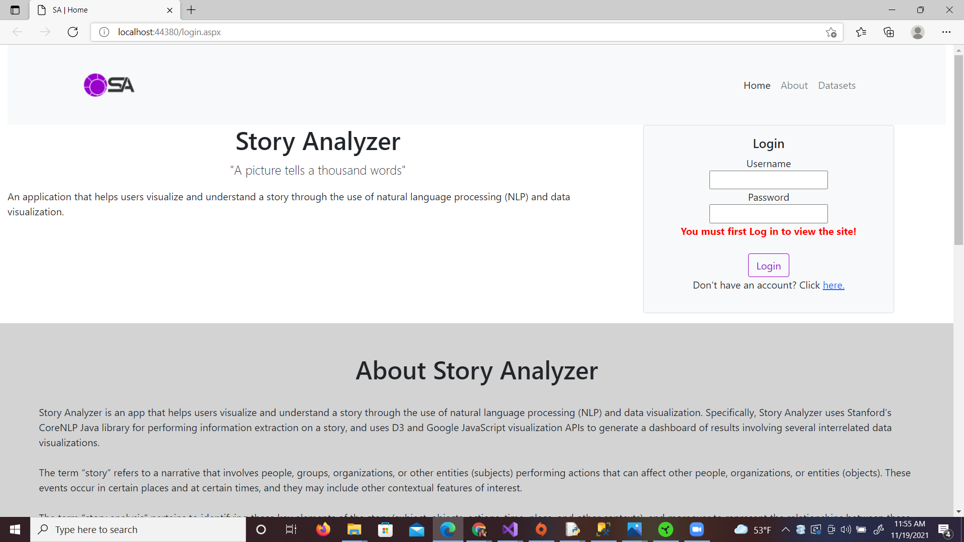
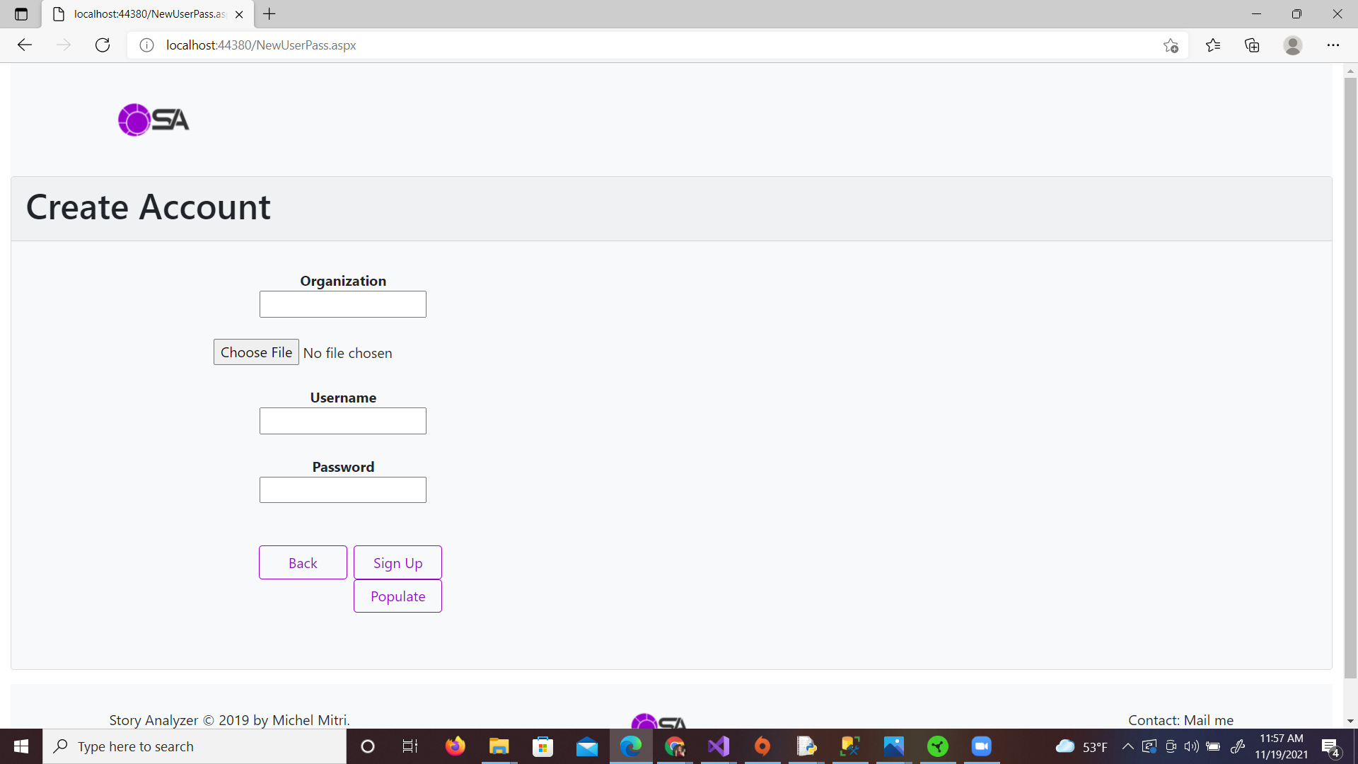
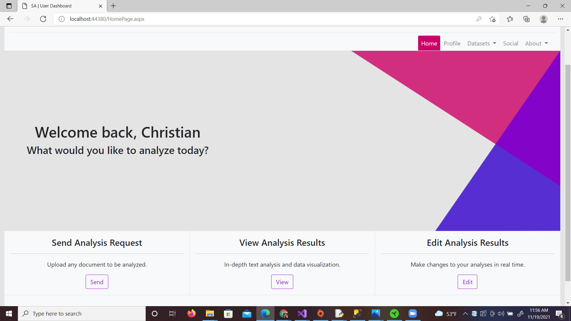
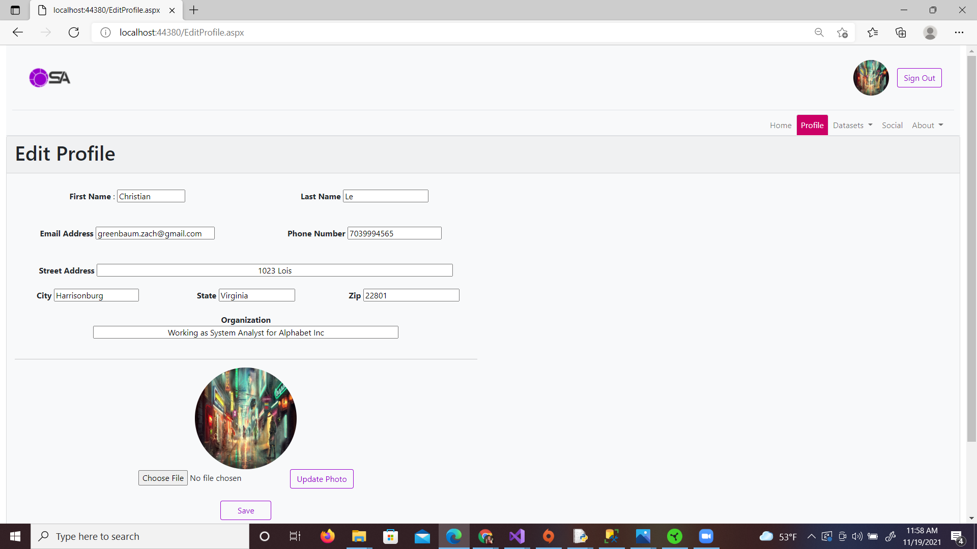
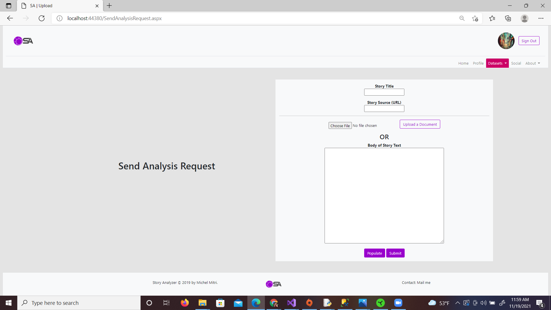
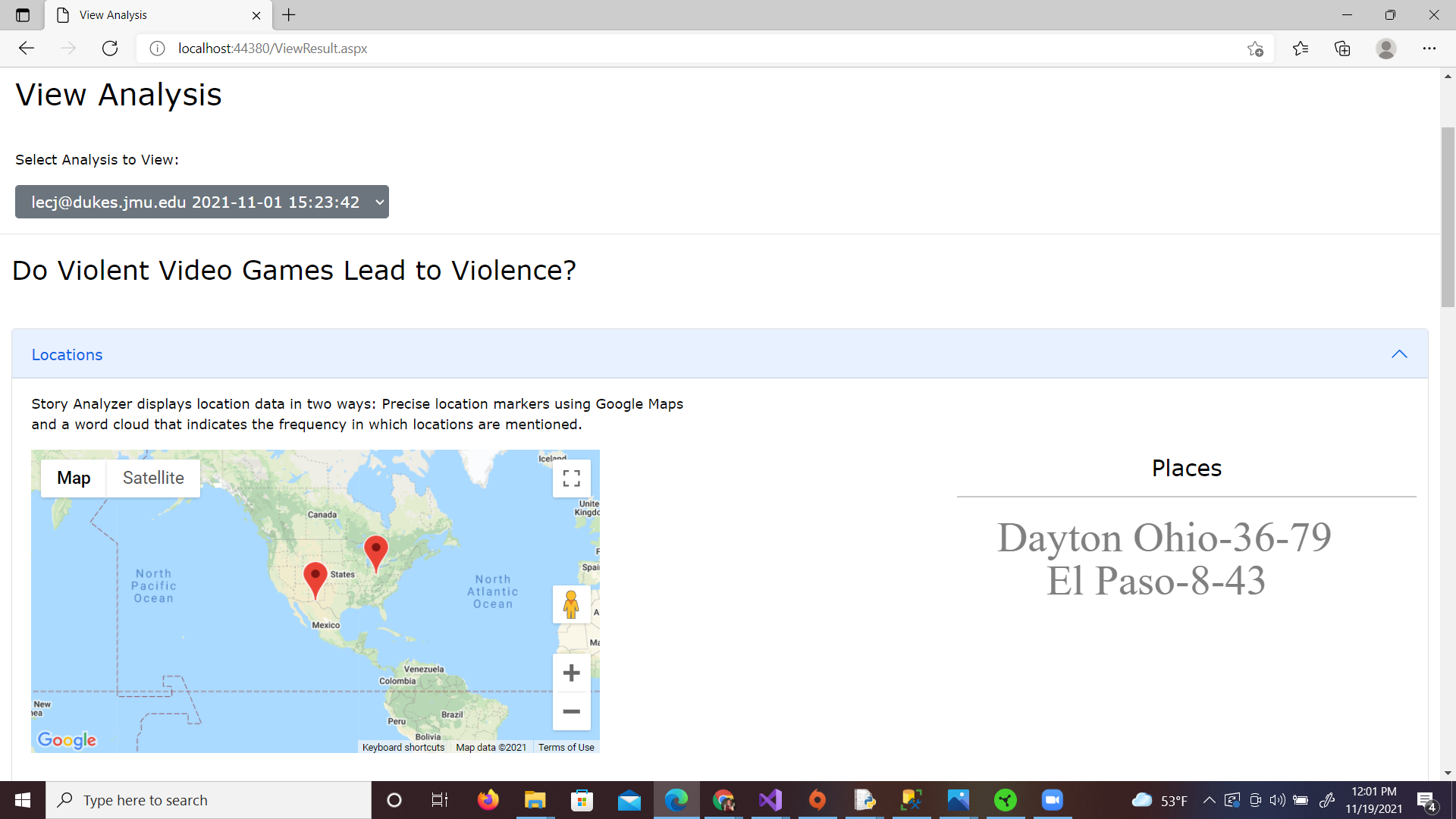
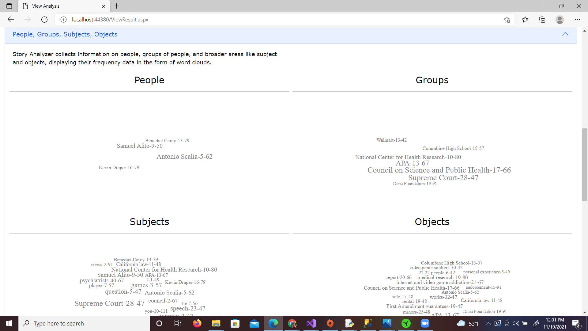
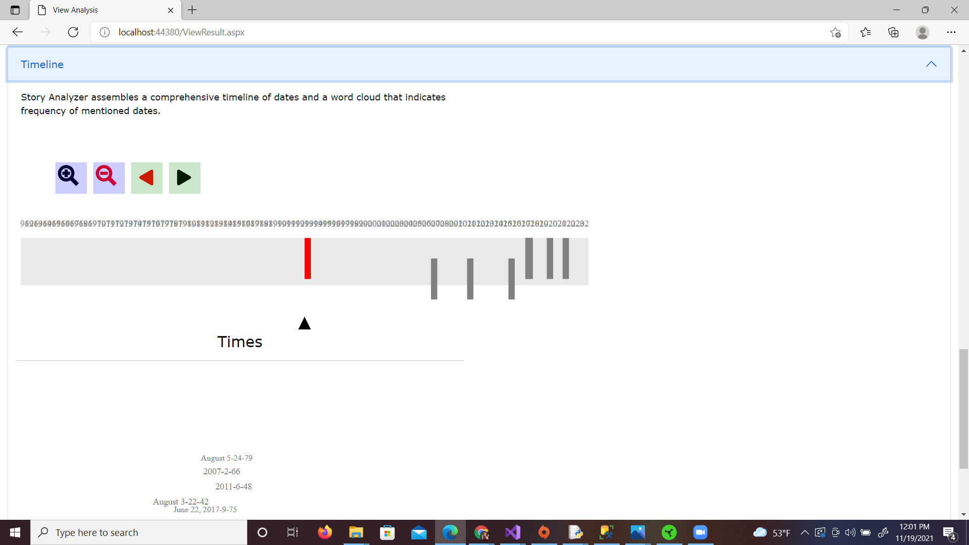
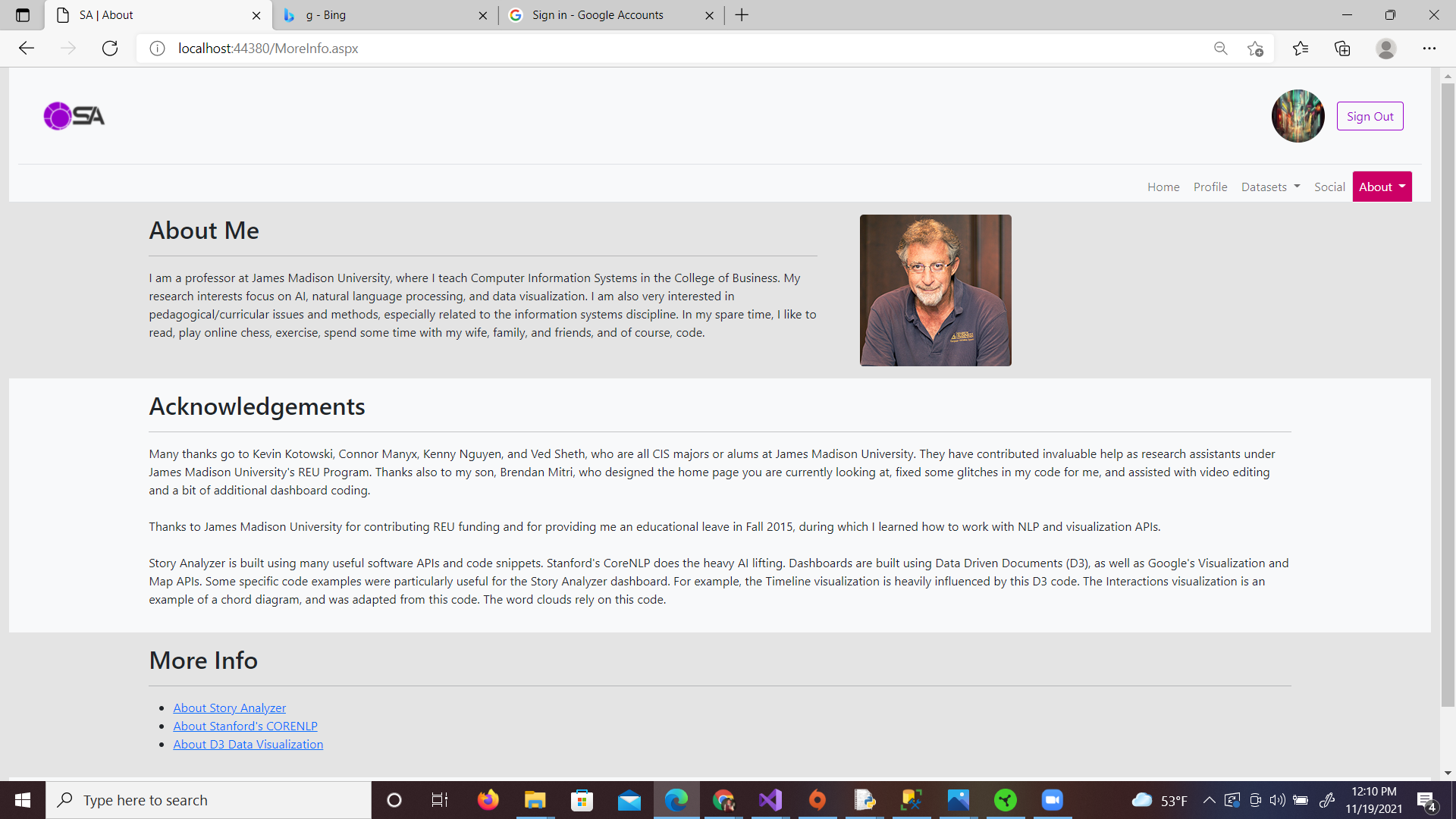
The Story Analyzer capstone project was the hardest tackled by Interactive Design and Computer Information Systems students so far at JMU, and was a unique and tough experience. Because of the enormous scale of the project and the small size of the teams, we worked in 3 sprints, and teams were tasked with getting as far as they could. Pacing was determined by the top teams, which included my own team. Much of the focus was on the back-end development of the site at the client's direction, so the front-end was only completed as far as you see here.
Multiple challenges presented themselves throughout this project that created valuable learning experiences. Working with a team of back-end developers with a different background and skillsets created a unique work environment for the project. The front-end team had to trust the back-end team when it came to their expertise, and vice-versa. One of the first major obstacles we encountered was integrating our Bootstrap 5 styles within the back-end team's code. Our group was one of the few teams to overcome this obstacle, which helped us pull ahead and make it to the top 3. Other challenges presented themselves in the form of teamwork and group participation, working with a client unfamiliar with UX practices and visual design, and the scale of the project.
My Role
- Worked with a team of front-end and back-end developers using Agile project management to develop the web interface for a client’s AWS-based story analyzer algorithm across multiple sprints
- Developed a logo and color schemes to revamp the Story Analyzer brand and web interface
- Conducted user testing at various stages to inform the development of the interface to meet user standards
- Created prototypes in Adobe XD for user-testing and to provide mockups for the back-end team
- Coded web pages to function with back-end developers’ code using the Bootstrap 5 content library and HTML/CSS
Invisible Text Row to Create Space
Story Analyzer Logo & Graphics
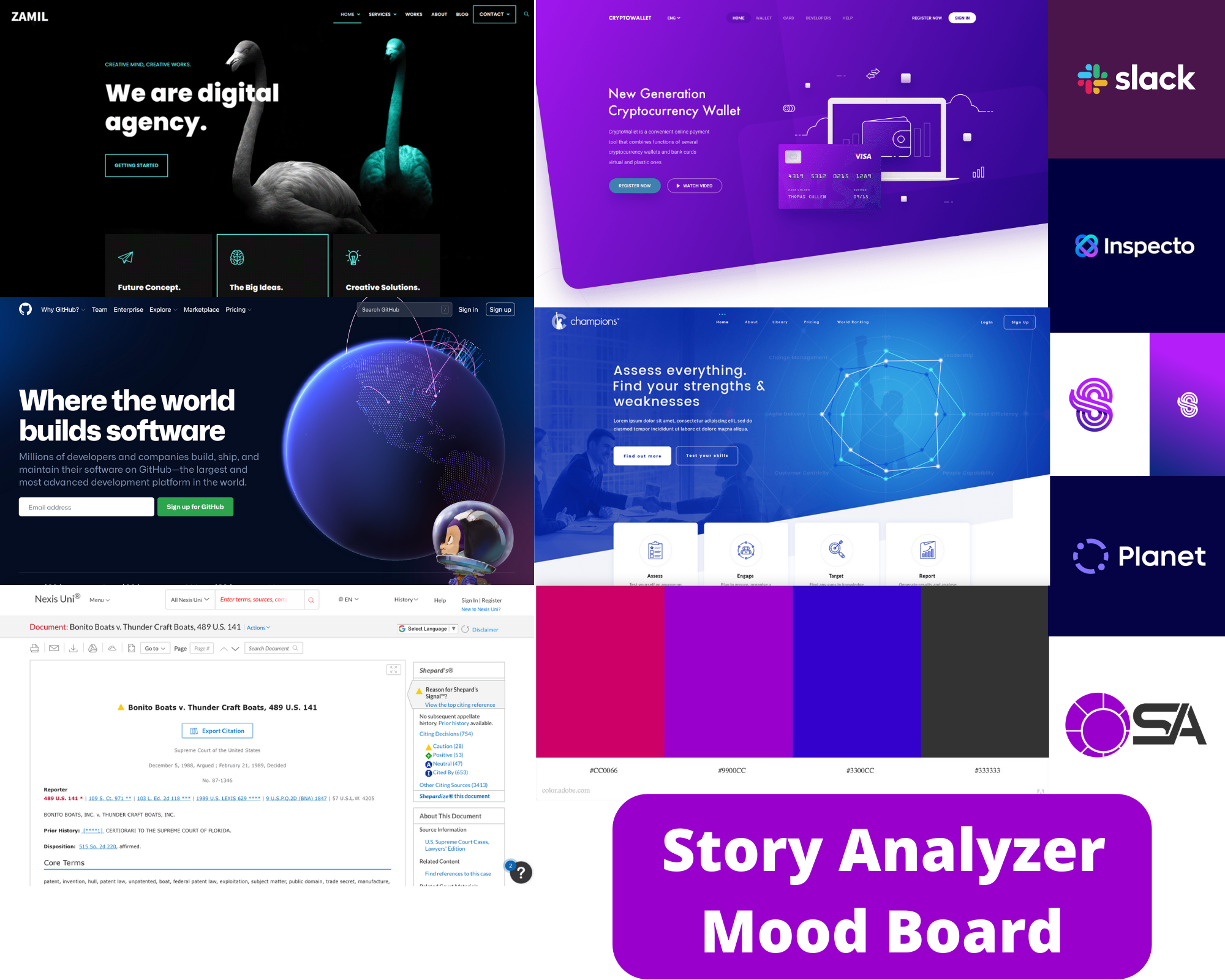
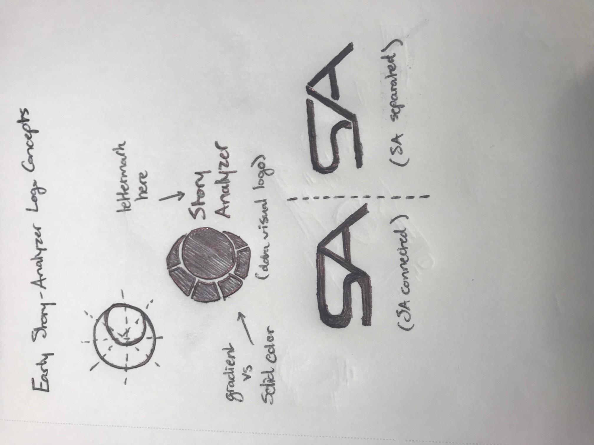
The Story Analyzer logo redesign was created by me, based off of the D3 data visualizations that the tool itself creates. This went through multiple iterations, and originally was going to contain the full words "Story Analyzer" as a lettermark, but these were shortened to "SA" for a shorter, cleaner look. The angular font was created to match the angles in the data visualization logo. A simple color scheme was created, which you can view in the below mood board, in order to be used for various buttons, visualizations, and other highlighted elements throughout the site. In the above carousel, you can also view some early graphics I created as placeholders while the site was being worked on. Because functionality was the main focus of the project and the client, these were simplified with the intent to create higher-fidelity graphics in the future.

Invisible Text Row to Create Space
Prototyping and Coding
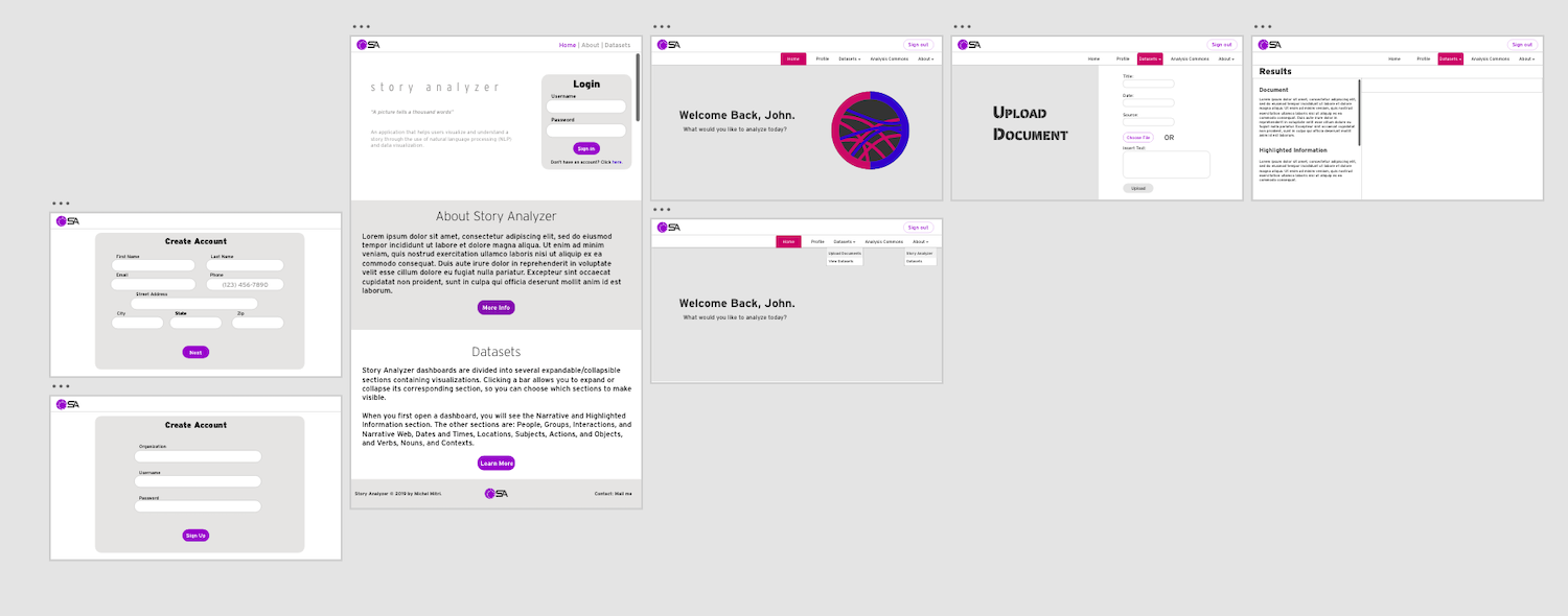
The front end team created an initial, simplified Adobe XD prototype based off of feedback from Dr. Mitri's original website, which was then used to inform the back-end developers on the pages that would need to be created as well as the functions each page would need. While the site was being created, it was hosted locally using Microsoft Visual Studio. We worked closely with the back-end team while coding the site to inform decisions on best practices and also to implement the styles we developed. The front-end side of the site was created using a mix of HTML/CSS and Bootstrap 5. Besides creating the logo and color scheme, I was one of the primary front-end coders working with the back-end team.
Invisible Text Row to Create Space
Invisible Text Row to Create Space
