Invisible Text Row to Create Space
Portfolio Website Creation
On this page, you will find the write-up that includes details about the creation of this website, including the relevant project materials. This site was created as part of my Interactive Design capstone class at James Madison University.
Invisible Text Row to Create Space
Invisible Text Row to Create Space
Invisible Text Row to Create Space
Project Resources
Invisible Text Row to Create Space
Final Synopsis
The purpose of this website is to show off my work in UX/UI Design, Web Design, and Visual Design to future employers or anyone else interested in my work. The site itself serves as its own piece of portfolio work that shows off my capabilities in a comprehensive way, as it required all three of these skills to create. Before creating this website, I set out some objectives that the site needed to fulfill. First, it had to be built from the ground up using HTML/CSS and encapsulate my work with photos, necessary links, and descriptions. It also needed a logo that represents me as a designer and a design scheme to keep the site consistent across multiple pages. The site also needed to be easy to navigate and account for accessibility and user standards, which would require user testing. Lastly, the site also needed to be future proof so I could add projects to it at the end of the semester and in the future.
Before I began coding the website, I needed to learn new skills to accomplish a project of this scale. I used LinkedIn Learning to learn Bootstrap, GitHub, and some information about what goes into a portfolio website. These skills were invaluable in the creation of this website, with Bootstrap providing web responsive elements and GitHub providing a testing ground to test versions of the site in different web browsers and on various devices of different sizes (the site is responsive on dekstop, tablet, and mobile).
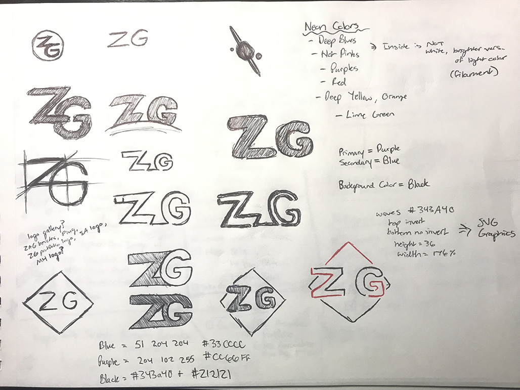
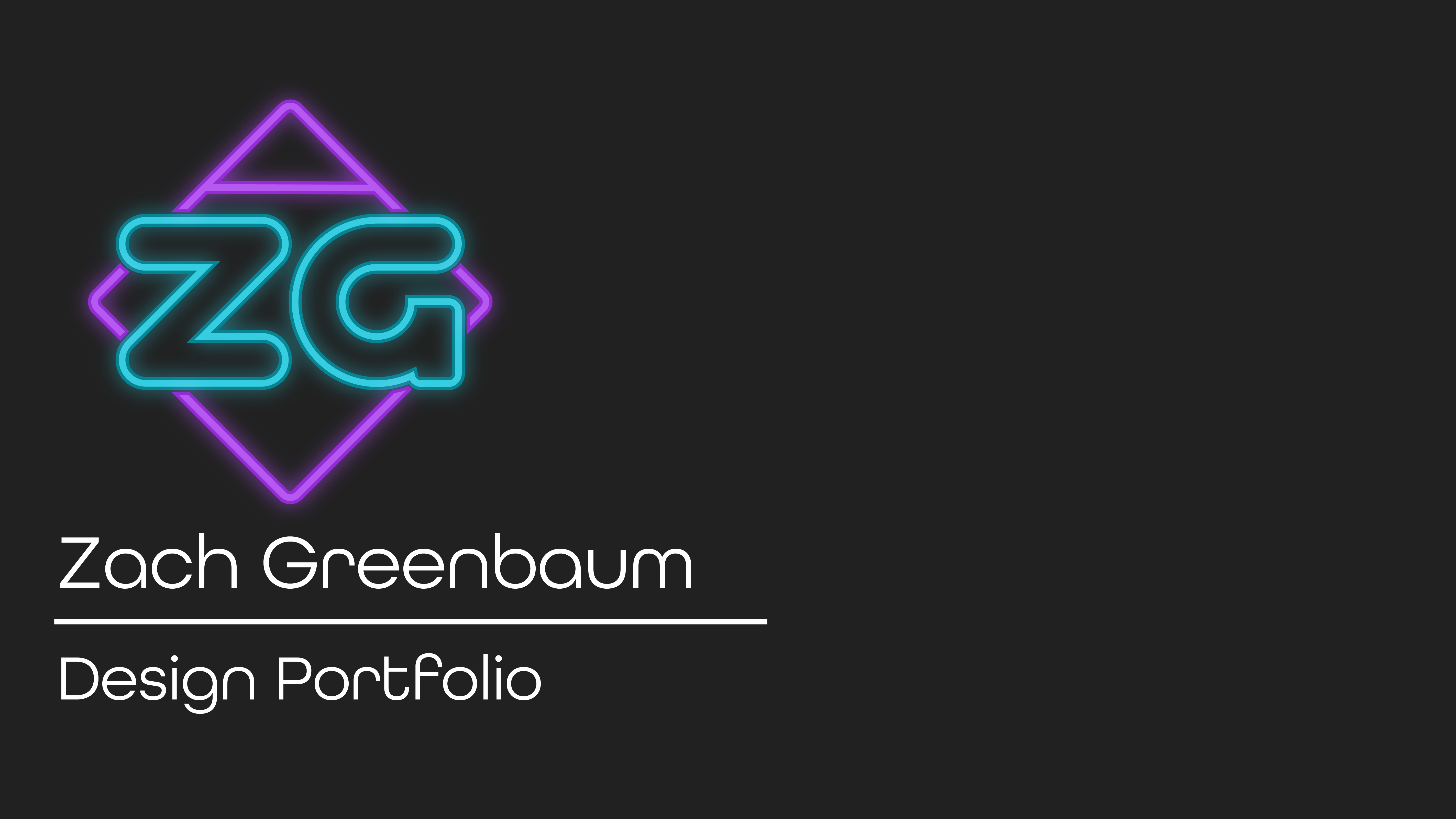
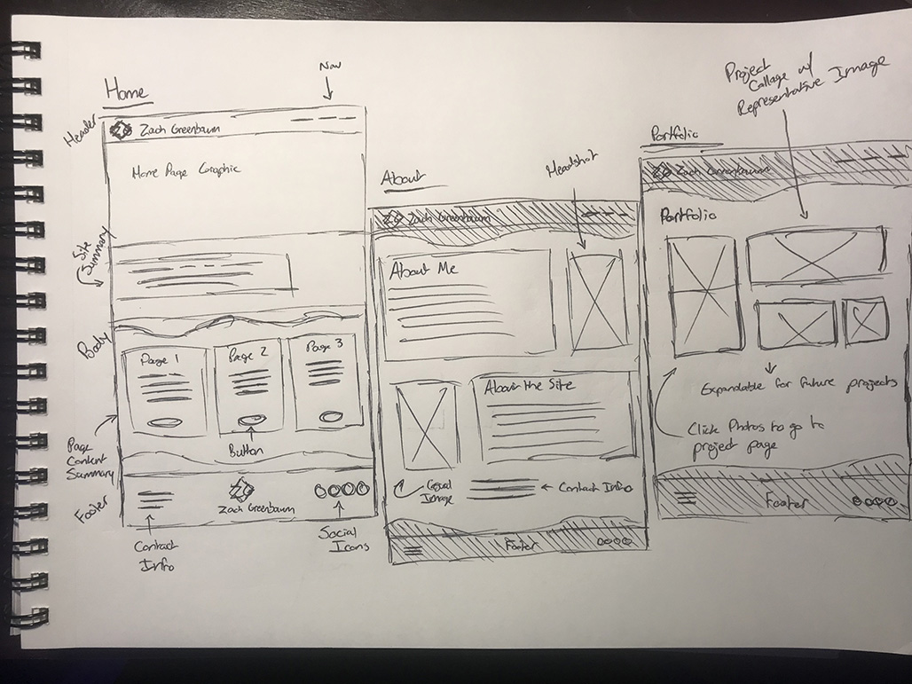
I also needed to make some creative decisions before the creation of the site began. I created a logo in Adobe Illustrator, with a color scheme created using Adobe Color. The logo and colors are inspired by neon signs, with a wireframe look and vibrant colors. I knew from the start I wanted the pages to have a dark look by default, and I was inspired by images of neon signs at night and the sprawling dystopian city in the film Blade Runner 2049. I also used the website Shape Divider to create some SVG elements for the header and footer of each page. I then used Adobe Fonts to pick a typeface to use for the headings of the site in the form of All Round Gothic, while retaining the Bootstrap font families for other elements so that the site is easy to use. Bootstrap Icons was also integrated for the social media icons in the footer of the site. I used the knowledge I learned from the LinkedIn Learning course on what goes into a portfolio to create the navigation and researched other design portfolios to create some sketches and wireframes of the various pages the site would require. I also created a list of the various elements each portfolio item and page would require, such as text and images. All images for the site were sized in Adobe Photoshop to be optimal for web.
After the initial design goals for the site were complete, I began to code the website using Adobe Dreamweaver and Bootstrap. Dreamweaver has Bootstrap integration built-in, so this was useful when creating the initial files for the various pages of the site. I used the LinkedIn Learning and the Bootstrap website to learn Bootstrap as I went, and this is where I ran into the first hurdles I needed to cross when coding the site. Originally, it was tough to override the Bootstrap files to create my own color variable and modify certain aspects of Bootstrap objects to fit my intended style for the site, and it took some time to solve this problem and get used to the many variables Bootstrap adds to HTML tags. Coding the site was the longest stage of the portfolio’s creation and required multiple days of work to complete. It is also important to note that the header and footer can be easily duplicated to create new pages for portfolio content and the portfolio section of the site can also be adapted to include these new projects.
The website is complete for this independent project and is currently being hosted on Netlify, which integrates with my GitHub repository for the site that contains the most recent version. Netlify allows for easy changes to be made to any of the site files and allows for a custom domain name to be integrated. Further changes will be made after feedback on SMAD day (November 5, 2021). Eventually, the intention is to condense this page into a smaller version for the portfolio area of the site.
Invisible Text Row to Create Space
Project Goals
- Creation of a portfolio website from the ground up that encapsulates all of my work
- The portfolio should show off my work with photos, links, and descriptions
- The site will require a logo and design scheme
- The site is easy for users to navigate and accounts for accessibility and user standards. This will require user testing to make sure the site meets this goal.
- The site is future proof so that it can be added to as I complete more projects throughout the semester (capstone & user research project)
Skills Required
- Bootstrap 5 to help with the website's development
- Knowledge of what goes into a proper portfolio website
- Advanced HTML/CSS techniques to create a unique website that also adheres to accessibility and user preferences
- How to purchase a domain name and host a personal website
Invisible Text Row to Create Space
Audience Personas
Here's the basic personas I created to represent the intended audience of my portfolio site.
Primary Persona - Mike
- Job: Supervisor at a Design Firm
- Role: Employer
- Age: 32
- Home: Ohio
"I'm searching for someone who will 'wow' me!"
Goals
Needs to efficiently hire new employees without it taking up too much time in his busy schedule.
Frustrations
Projects running behind schedule, searching for skilled employees, new problems interrupting his already-busy schedule.
- Tech Savvy
- Analytical
- Extrovert
Secondary Persona - Hannah
- Job: Project Manager
- Role: Client
- Age: 35
- Home: North Carolina
"Design work is way out of my league."
Goals
Wants to recruit a designer to provide some design insight on a project. Has a vision!
Frustrations
Worried about outsourcing important projects, needs to stick to a strict timeline, needs accountability from her employees.
- Tech Savvy
- Creative
- Extrovert
Invisible Text Row to Create Space
Style Guide
Here's the style guide for the main colors used on the site as part of the theme, graphics, and logo. These specific colors are web safe and have been coded into the Bootstrap variables the way they are named here. The themed typeface is "All Round Gothic" from Adobe Fonts and is used across the site as a title only. All other fonts are the Bootstrap defaults for accessibility.
Primary
- RGB: 204 102 255
- Hex: #CC66FF
Secondary
- RGB: 51 204 204
- Hex: #33CCCC
Dark
- RGB: 33 33 33
- Hex: #212121
Invisible Text Row to Create Space
Initial Visual Inspiration
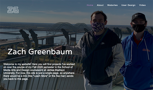
Here's an early concept of the logo and a single-page portfolio site I had created initially before this site that served as inspiration for the final product you see here.

Invisible Text Row to Create Space
User Testing
Throughout the creation of the site, I user tested at various stages to make sure that the site was easy to use and responsive on multiple devices. Because this is a personal portfolio, I recruited from family and friends to get feedback from the people who know me most and people that I trust with a piece that is integral to my work at JMU. Participants were interviewed in a 1-on-1 virtual setting. I observed participants by sending the link to my GitHub Pages that this website was tested on and asked them to complete various tasks on the site. I watched as they navigated the site and then asked for feedback that would help improve my website.
Here's what I asked the participants:
- Can you navigate to the About page? The Design Work page?
- Can you find the work I did for Plug? (Starting from the home page)
- Take a moment to navigate throughout the site. What do you like? What do you dislike?
- What are any improvements you would make to the site?
- Are there any improvements you would make to navigation?
Here's what I learned from my user testing:
- Add navigation to headers on the home page, as well as the logo icon in the header and footer so that user's have multiple points of navigation based on personal preference and familiarity.
- Make the site responsive on mobile devices. My own phone is an older model and smaller, and I had not originally taken into account newer, larger screens. I used the Bootstrap grid system to create breakpoints and fluid content withing the grid to help fix this issue.
- Make the hero graphic smaller. Originally, the hero graphic was too large on the screen and also conflicted with the navigation. I created a unique nav bar on the home page only that works with the header, which I also downsized.
Further user testing still needs to be done once more projects are completed and added to the site, and I hope to gain crucial feedback from this assignment and the alumni portfolio review at SMAD Day on November 5th.
Invisible Text Row to Create Space
Web Hosting
This site is hosted using Netlify, which is a free website that lets users host static sites. Netlify also has GitHub account integration, so I've linked the active website directly to the GitHub repository for the site in order to make it easy to add to my portfolio in the future, a crucial objective in the task to build the site. I purchased and registered the unique domain name through Google Domains. Netlify allows accounts to use a custom domain name as long as they can verify that you are the owner.
The Future
- Add more content showing the process of key projects
- Update the site with content areas for Story Analyzer and the research I'm completing in SMAD 327
- Get valuable feedback at SMAD Day on November 5th
- Condense this page into a regular portfolio page
- Add home page introduction animation for first-time site visitors
- Align the buttons on the page summary section of the home page. This is something that involves more complex code because the normal code is overridden by the Bootstrap row & column system.
Invisible Text Row to Create Space
Additional Resources
Here's a link to the GitHub Pages repository where this site was tested:
GitHub Pages Portfolio Repository
Here's a link to the GitHub repository where you can view the files of the original project proposal:
GitHub Independent Project Proposal Repository
Invisible Text Row to Create Space
Invisible Text Row to Create Space
